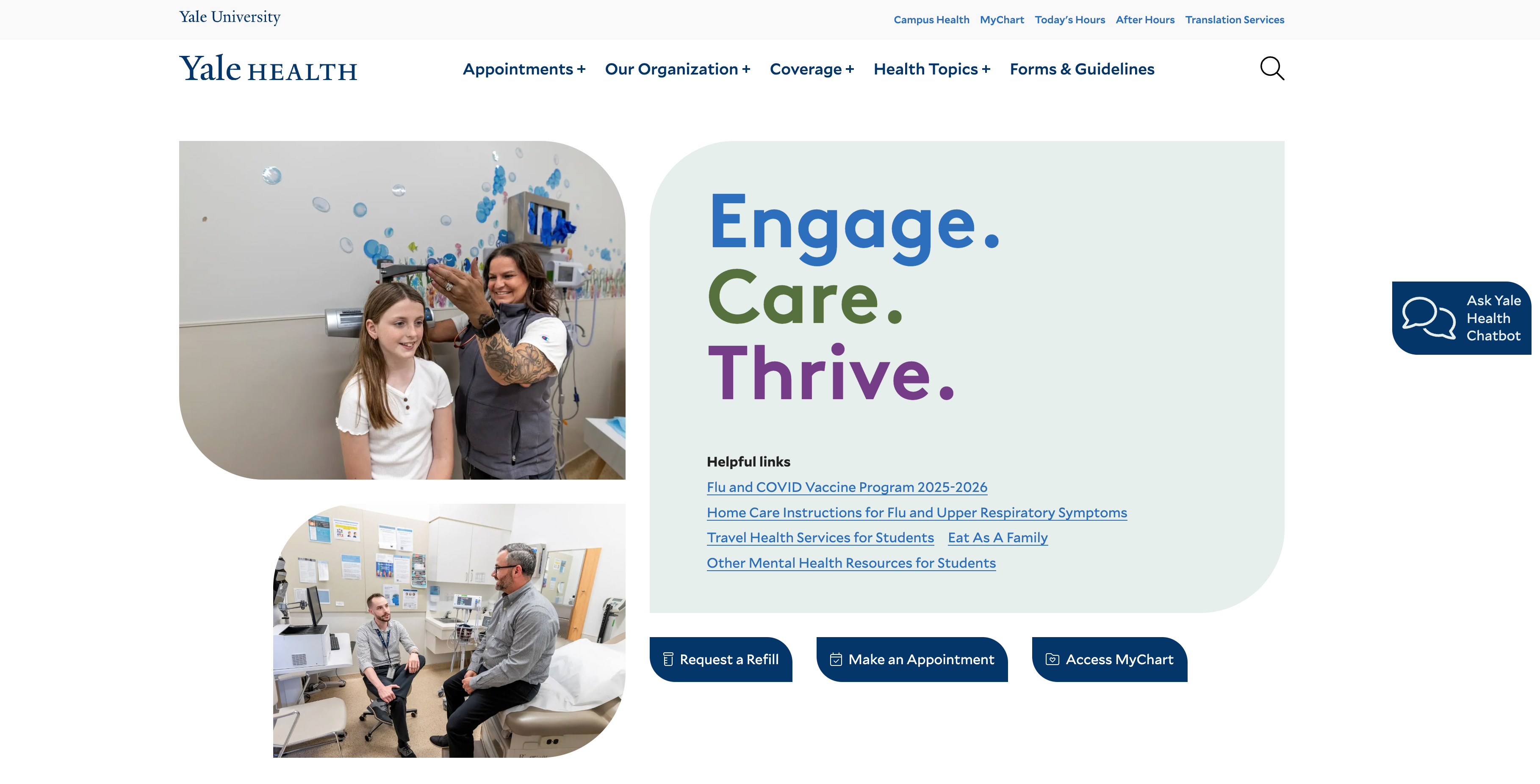
Strategic redesign puts members first

A modern healthcare website must do more—it must anticipate needs, reduce stress, and support members in navigating complex, often urgent, decisions.
Yale Health’s previous website was structured around internal organization, not member behavior. Users struggled to complete basic tasks, like refilling prescriptions or making appointments, because critical actions were buried, content was dense, and terminology didn’t reflect how members actually searched.
We led a research-driven redesign anchored in empathy, activity-based behavior patterns, and member trust, reframing Yale Health’s website as a dependable partner in care. By introducing strategic activity groups, guided search, and a modular design, we aligned Yale Health’s digital experience with real-world tasks and expectations.
The Results:
The Yale Health website redesign led to a faster, more intuitive user experience. Key engagement metrics show users find what they need more quickly and interact with more content per visit. High engagement on student and service pages reflects greater trust and alignment with real-world needs, validating the member-centered design approach.
The Challenges
Yale Health needed to overcome several significant hurdles to achieve its objectives, including:
Disjointed Navigation
Key actions like refills and contact info were buried or mislabeled. Members often clicked through multiple unrelated pages to complete a task, creating friction in even the most common interactions.
Confusing Language
Internal naming conventions didn’t match user search terms. Students unfamiliar with medical jargon and retirees navigating complex systems were especially likely to misinterpret or overlook important content.
Generic Experience
The duplicate content was shown to all users, regardless of needs. Without audience targeting, the site failed to reflect its primary member groups’ unique priorities and contexts.
Visual and Cognitive Overload
Dense layouts and scattered priorities slowed users down. Visitors faced too many choices and too little clarity, often abandoning sessions or turning to phone support as a fallback.
Our Solutions
To address the complex challenges faced by Yale Health’s website team, we proposed and implemented the following solutions:
Activity Group Framework
Defined two core behavior models to guide UX: the urgent task-seeker and the focused information explorer. This approach allowed us to design workflows and page structures that matched members’ intent and emotional state at each point of need.
Persona-Driven Content
Introduced layout components and filters tailored to students, retirees, and employees. This ensured users encountered relevant guidance early in their journey, reducing confusion and boosting confidence in the site’s utility.
Guided Search + Folksonomy
Implemented an intuitive search with synonym support and everyday language. Whether a user types “stress,” “anxiety,” or “mental health,” they’re now guided to the right resources—no insider terminology required.
Mobile-First Simplicity
The design is streamlined to reduce stress and support quick, on-the-go interaction. Fewer distractions. Faster load times. Clear calls to action—designed for stressed users on the go.
The Results
The redesign led to improvements in several key performance indicators (KPIs), including: